
_________________________________
The Challenge
The existing solution provoked biased performance ratings by design, so the most critical task was to design a system that moved away from scales and metrics towards 'choosing and applying' (skills and talent descriptions).
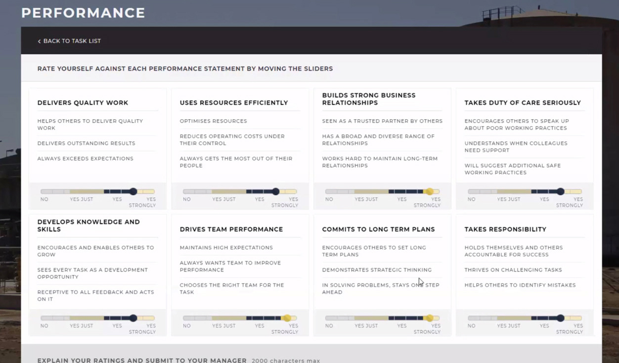
Example of old interface that invited biased performance rates
Paradigm Shift: From Scales and Metrics to Choosing and Applying
Having a clear understanding of the interaction mechanism, I embarked on conceptualizing the specific types of user interactions. To efficiently convey initial design direction ideas at a wireframe level, I crafted multiple rapid prototypes.
_________________________________
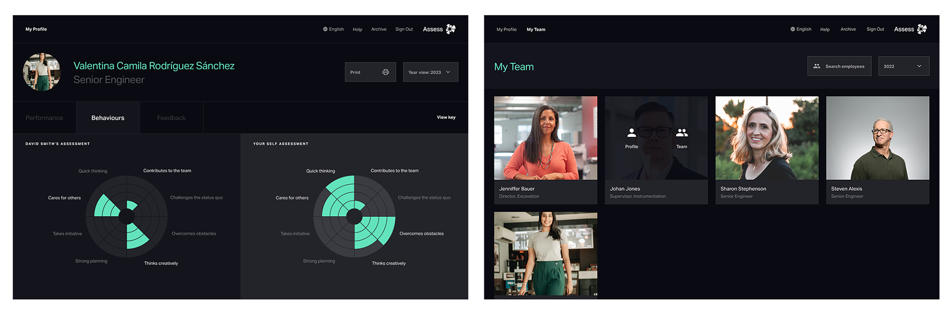
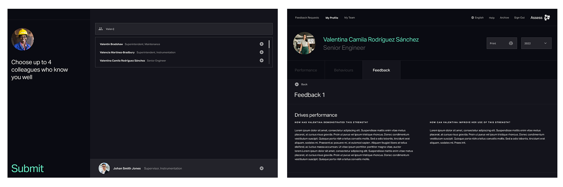
The solution
The winning concept revolves around an interaction that simulates the sensation of selecting cards from a stack, offering users an engaging experience. Deliberately adopting a scattered format, the content allows users to delve into more detail as desired, with descriptions revealed upon clicking, or swiftly navigate through without additional information when unnecessary.
All metrics and scales have been eliminated, with ratings conveyed through textual representation. Below, the video showcases the final designs* in a Figma prototype, ready for development.
* All Visual Design concepts were originally created by "Without Studio, London"
_________________________________
Phase 2
In the second phase, we meticulously scrutinized and translated the brand and UI screen designs, furnished by Without Studio, into a comprehensive interface spanning over 6 epics. We elaborated on extensive user flows, delineating every potential interaction within the complex system, catering to diverse user groups and various system cycles.
Subsequently, we delivered development-ready, interactive prototypes vividly showcasing all essential animations and transitions essential to the application.