THE CHALLENGE
18 consortium partners set out to build a system that facilitates human reasoning and analytic discourse, protects against cognitive bias, directly interacts with data objects and uses interactive, spatial-temporal visualisations- in full compliance with legal, ethical and privacy norms.
MY CONTRIBUTION
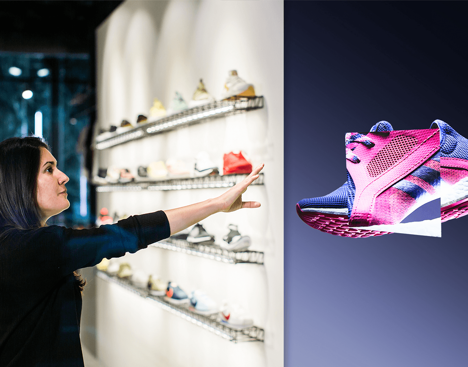
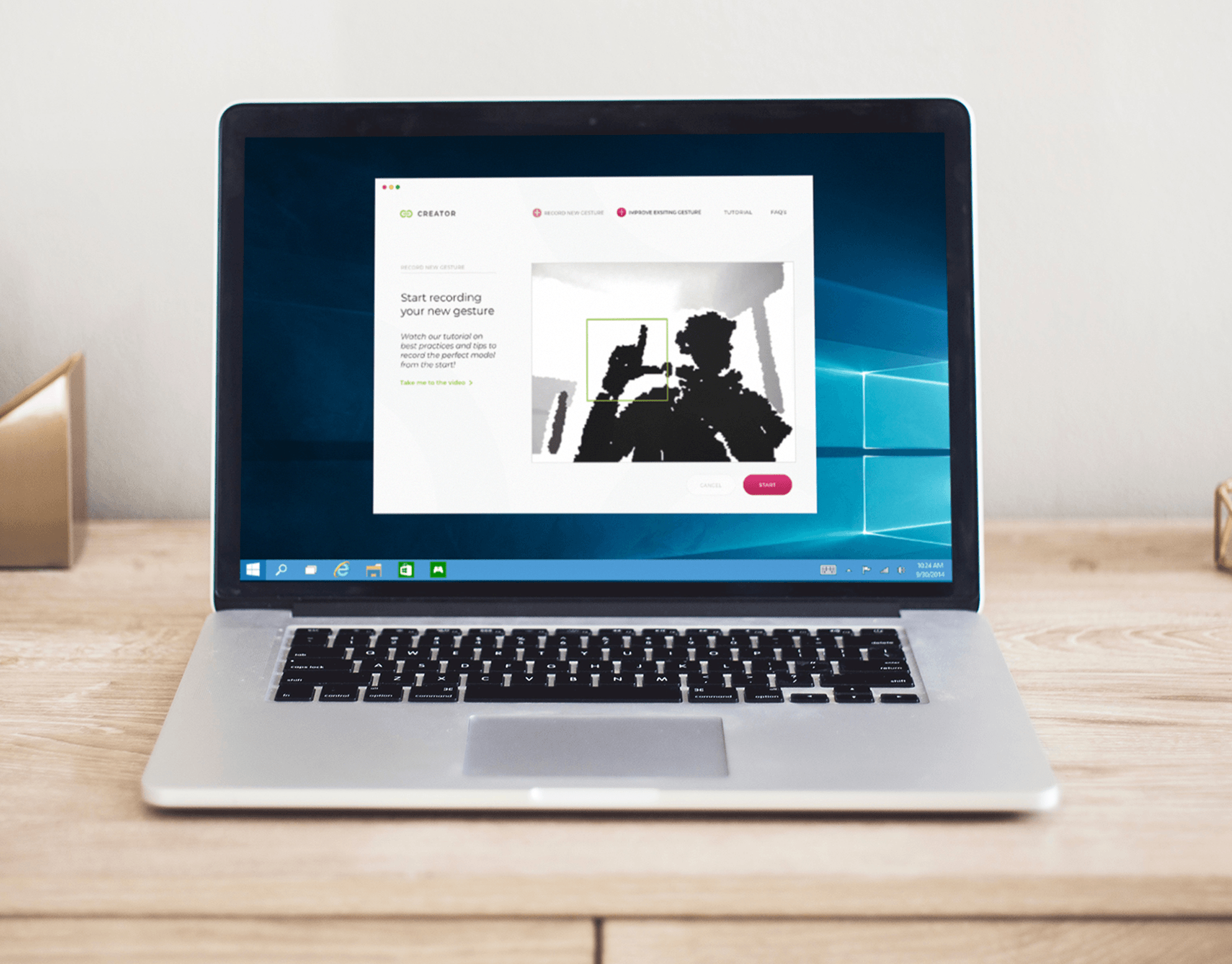
For this project I have carried out a variety of design tasks auch as Interaction concepts for gestural workspaces and UI Design for large data handling.
In addition I was responsible for budget planning, allocation and delivery of periodic and final financial statements.
______________________________________
VISION VIDEO (kick off)To facilitate a constructive discussion amongst 50+ people at the kickoff, we produced a vision video. It showcased a first potential approach to a system that assists various key people in the process to make sense of large data sets while collaborating on a European scale.
For the movie I assisted with user research (police UK) to identify pain points and a new solution approach, created the story board and supervised the video production.
Illustrations: Natalia Arias A. Motion Graphics & Post Production: Nariasat + Nelson Quiros
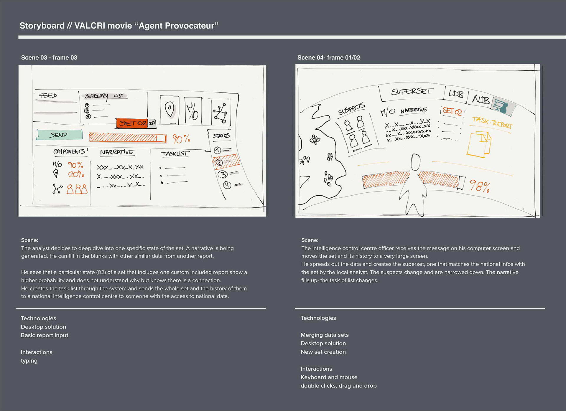
Example storyboard scribble
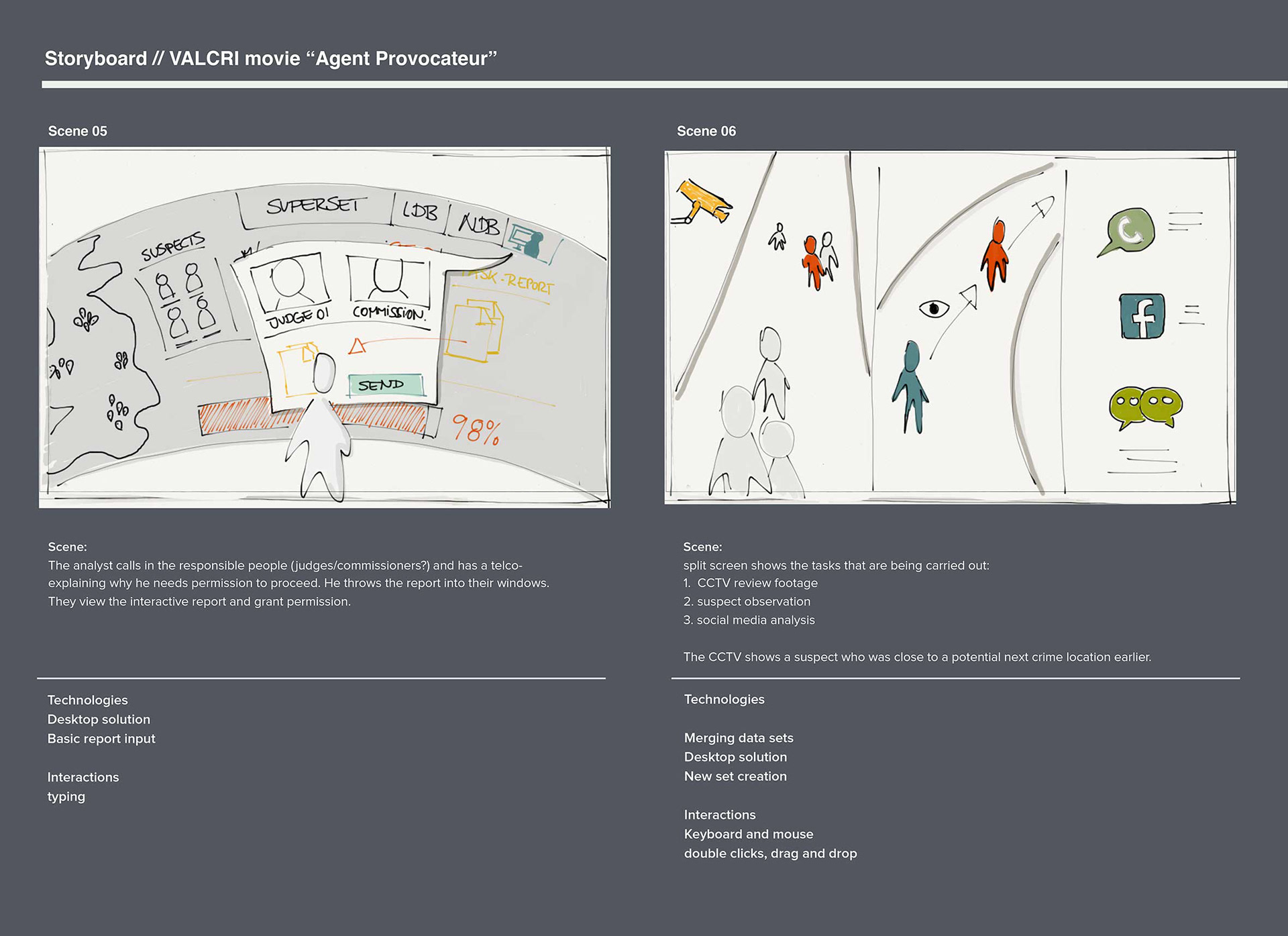
Example storyboard scribble
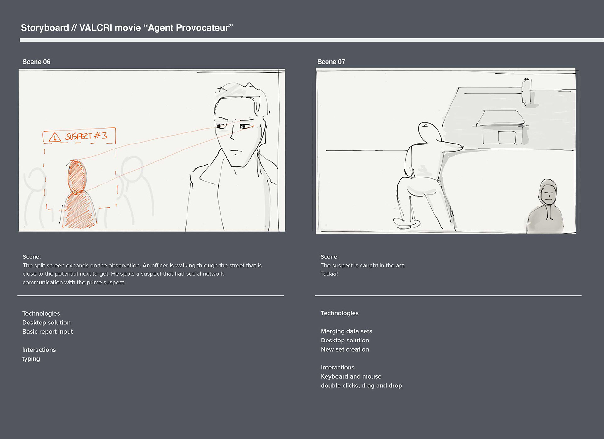
Example storyboard scribble
______________________________________
Interaction and Visual Design guidelines
As design evangelists we worked on specifying User Interface and Visual Design guidelines for the intelligence officers workspace.
These specs included the creation of:
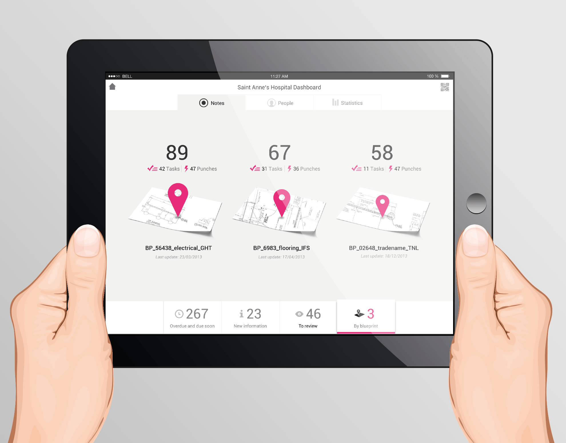
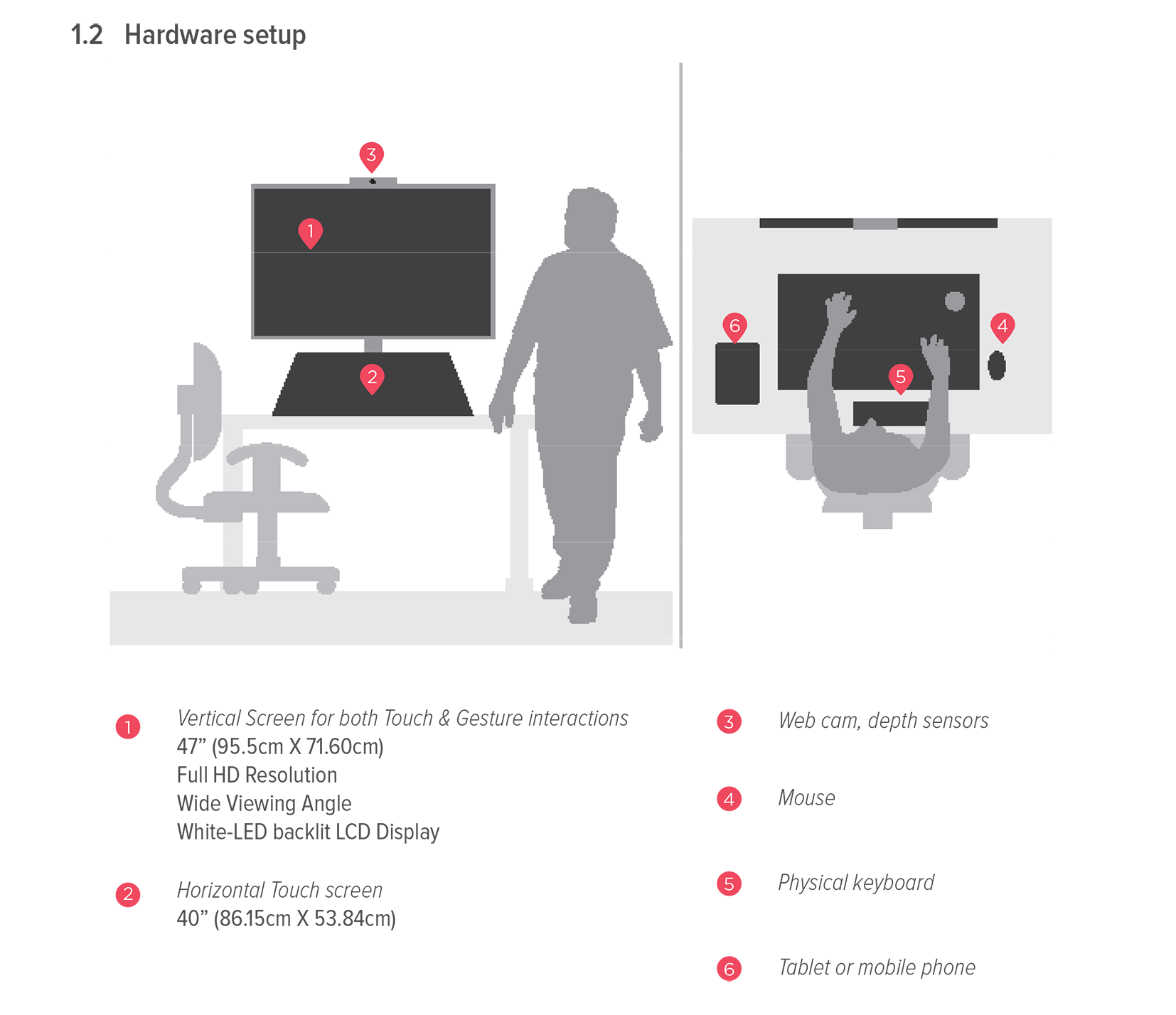
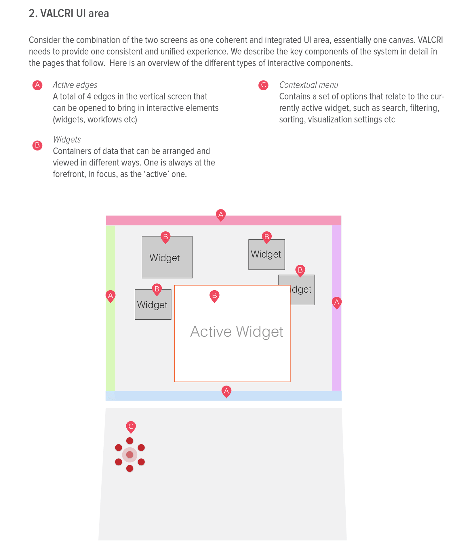
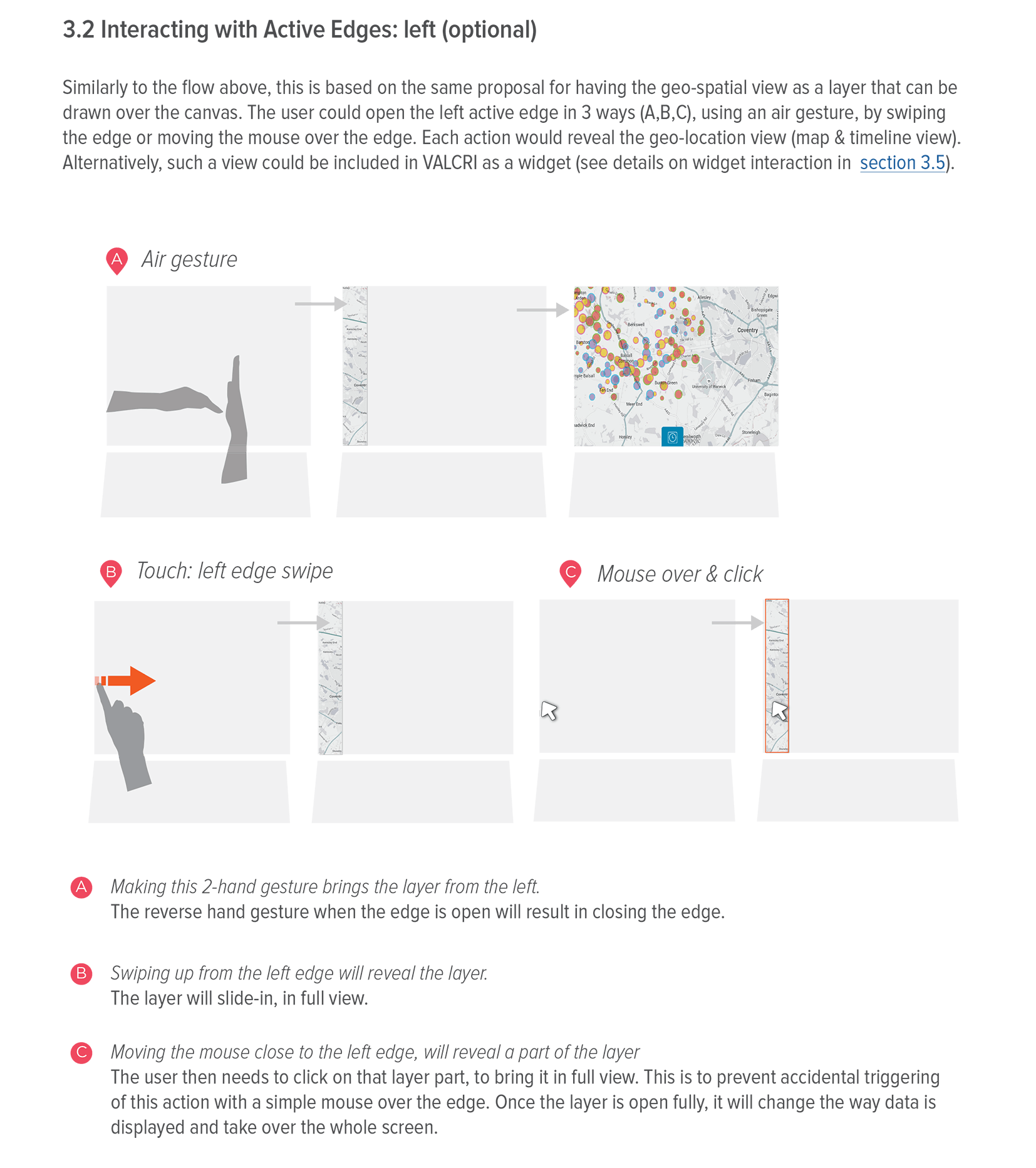
hardware set up // multimodal interaction (gestures, touch and mouse/keyboard) // integrated UI space (how multi screens assist the user) // essential UI elements such as dashboard view and the use of screen edges to trigger specific functionalities // UI Design and Visual representations.
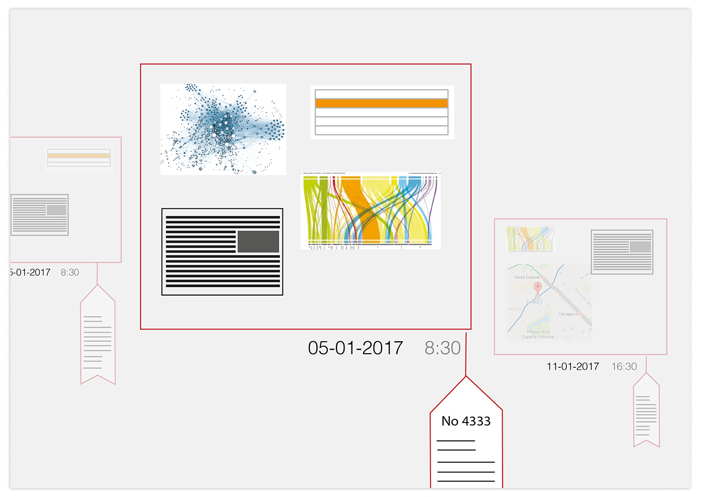
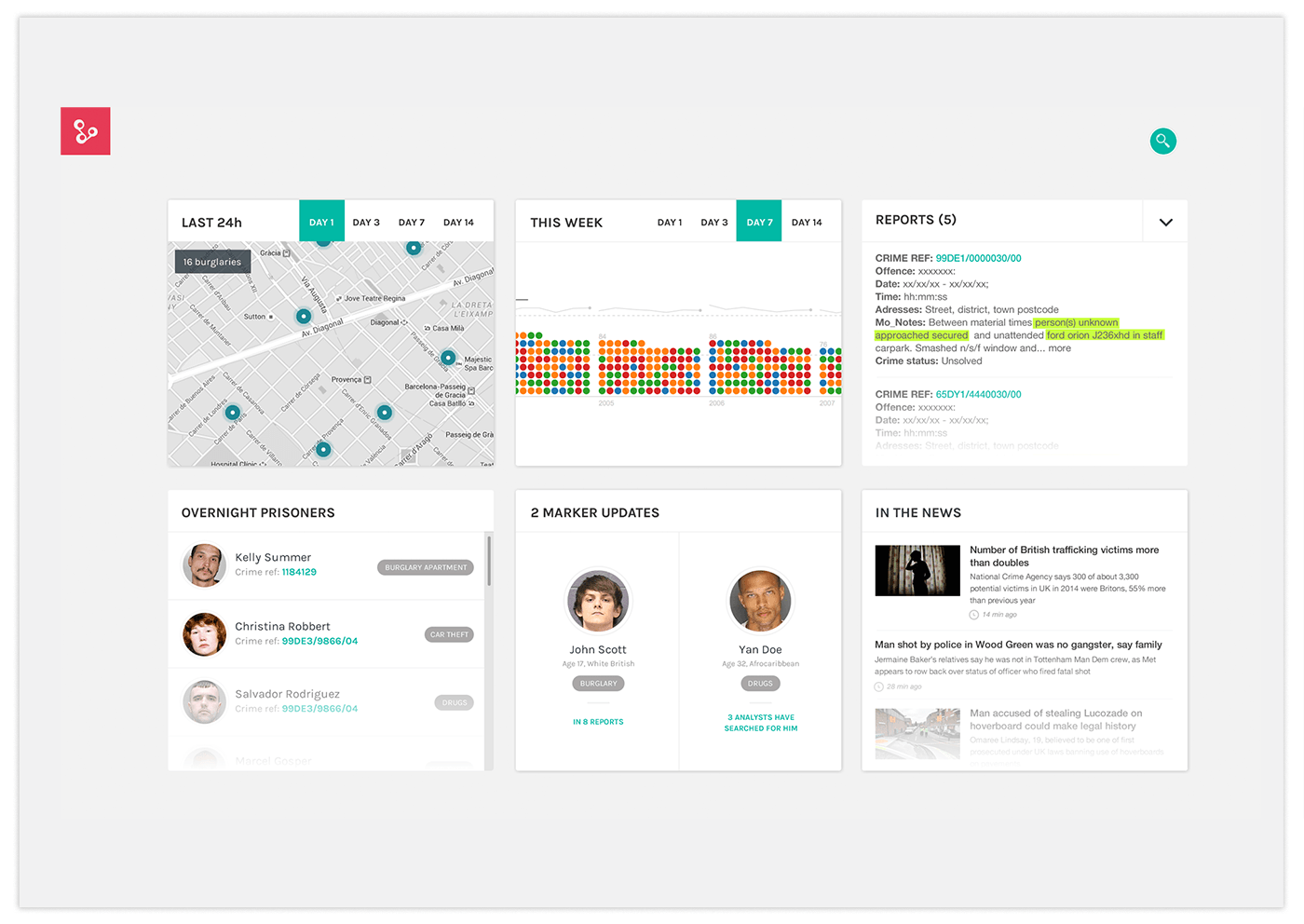
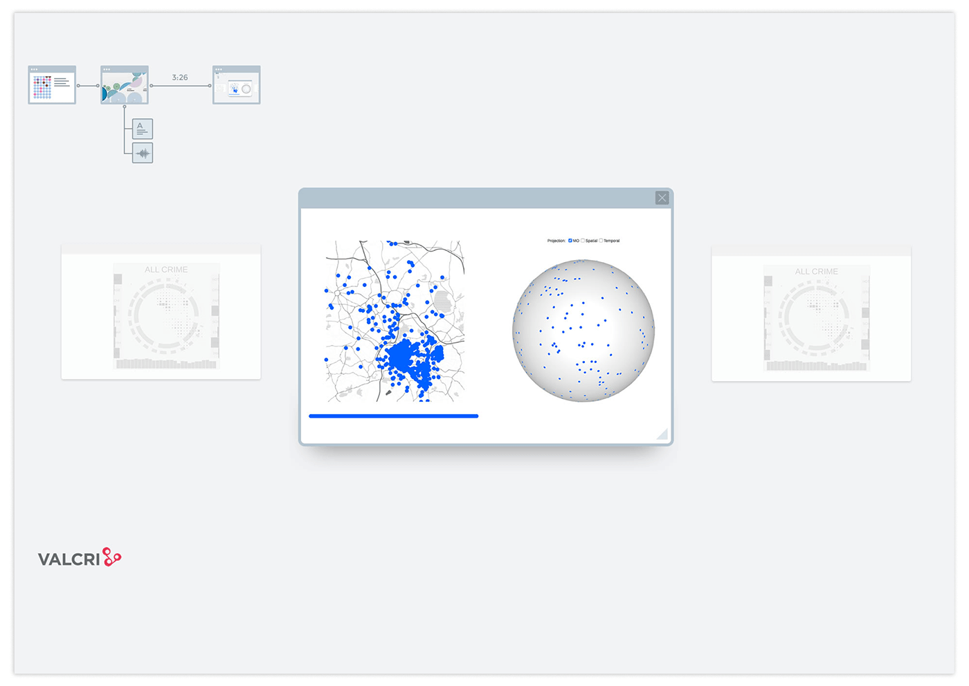
Below follow example images of interim deliverables UX and Visual Design guidelines that I actively participated in.
Samples of interim Interaction Design guidelines:
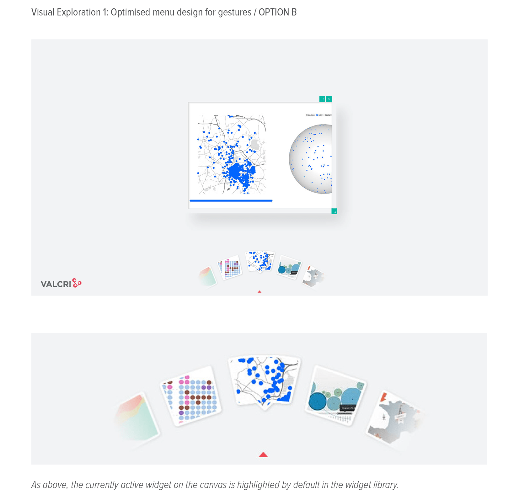
Samples of interim Visual Design guidelines:
Dashboard concept - VD guideline sample
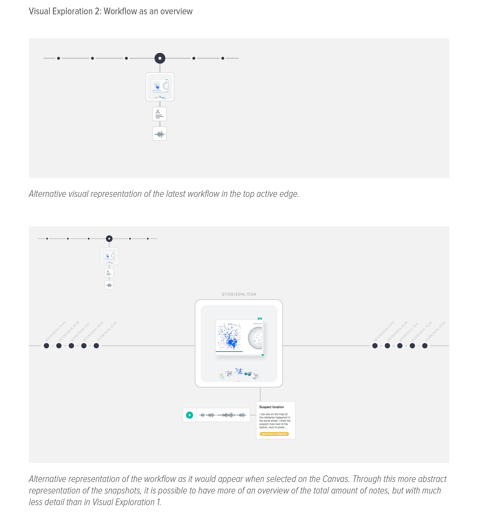
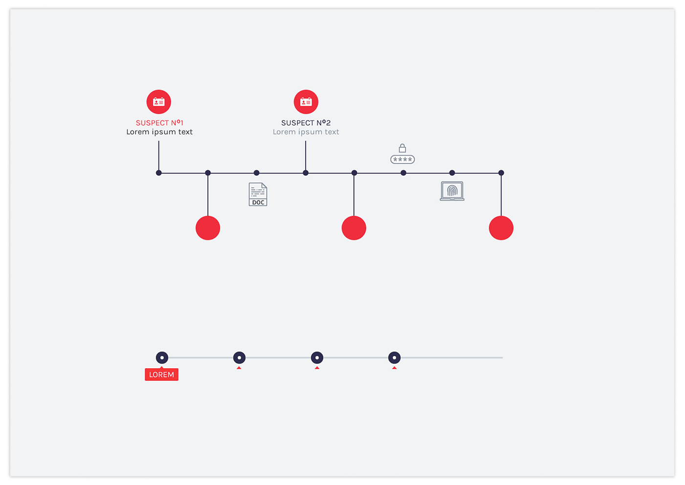
Provenance concept - VD guideline sample
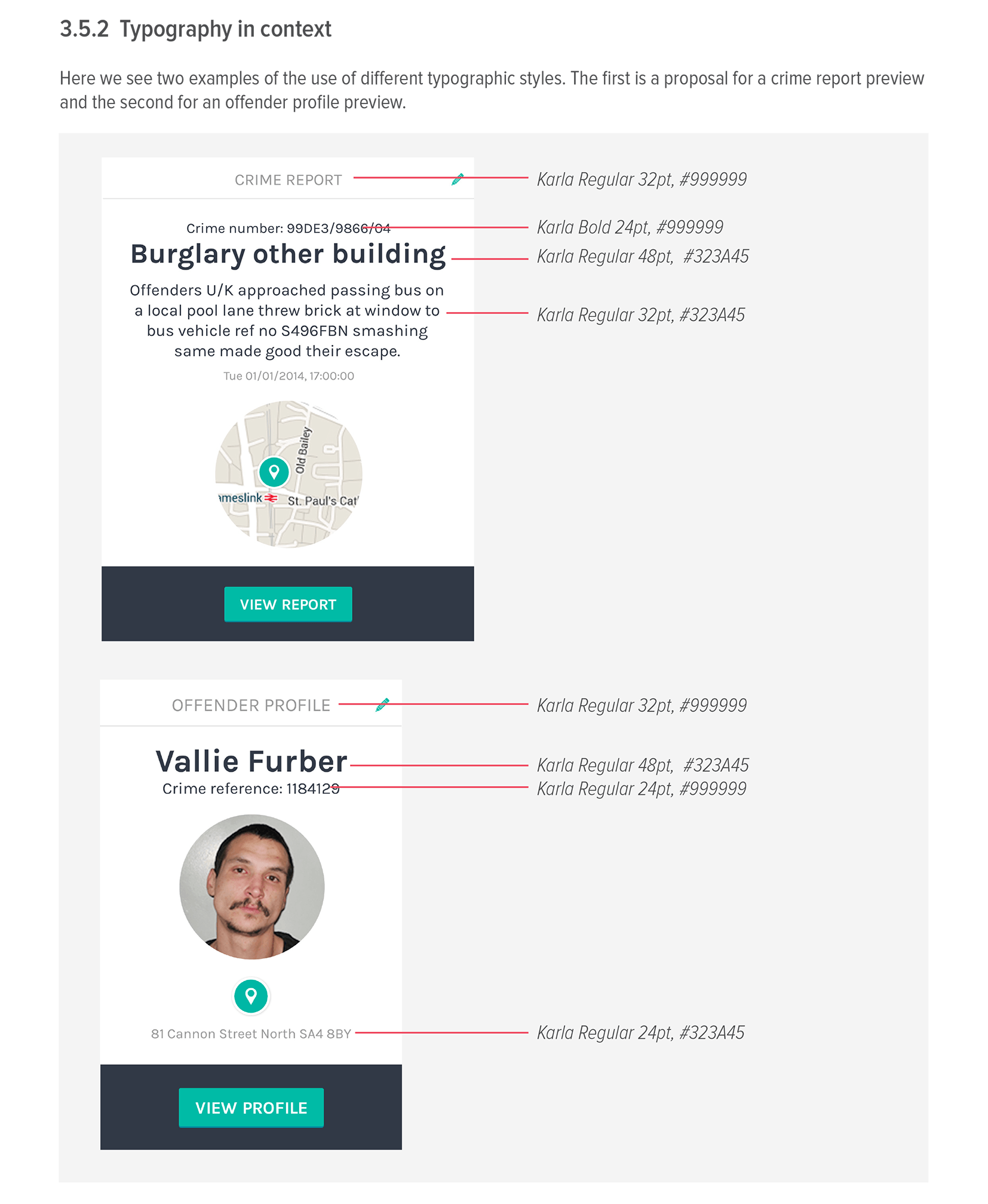
Typography - VD guideline sample
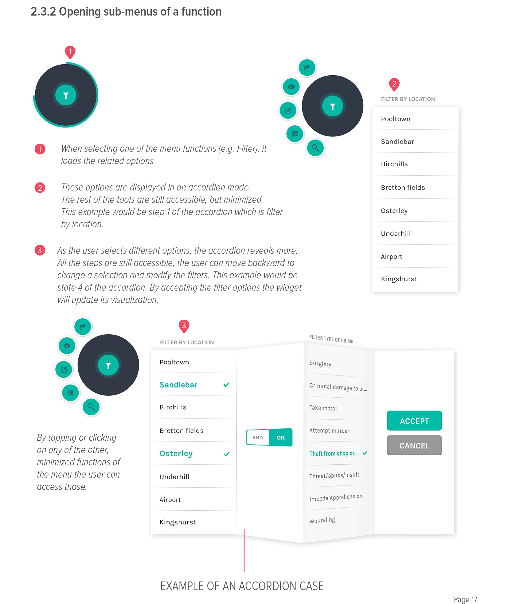
contextual menu ideas - VD guideline sample
Samples of Visual Design Explorations:
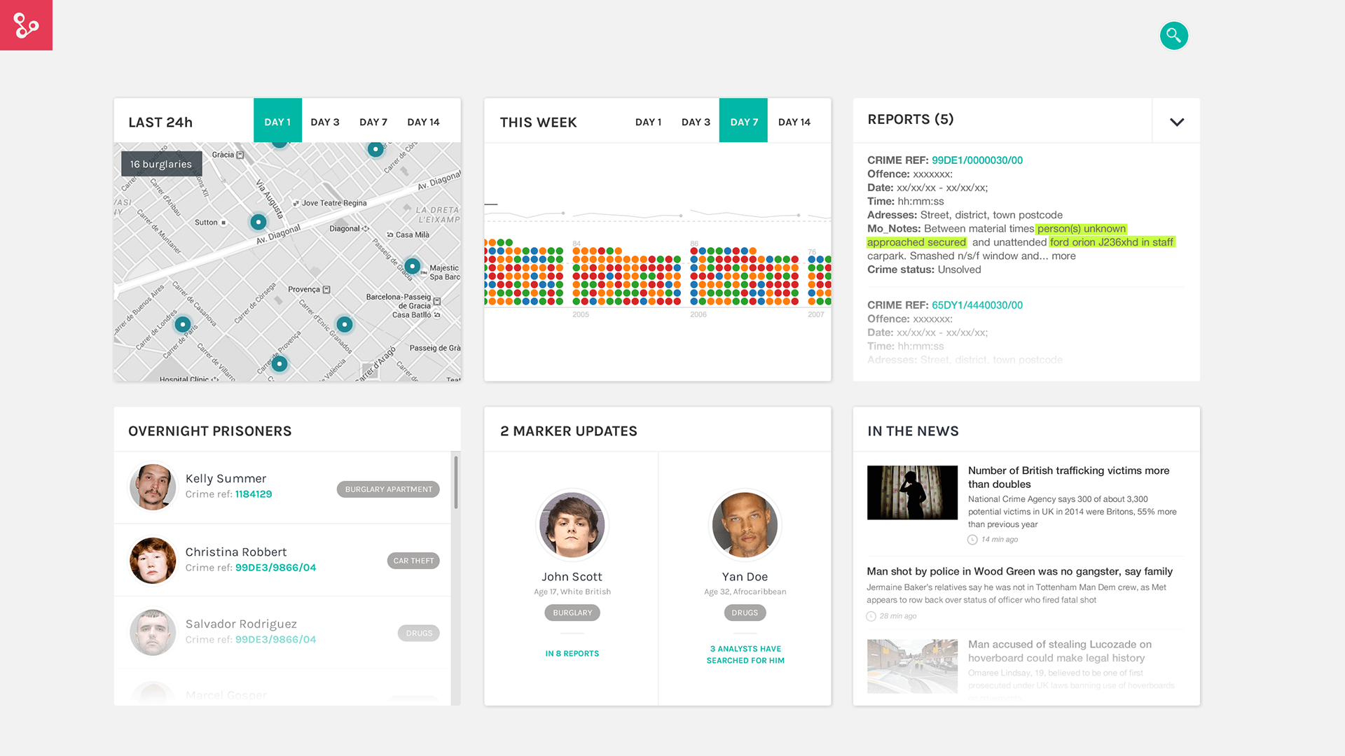
Dashboard Design exploration
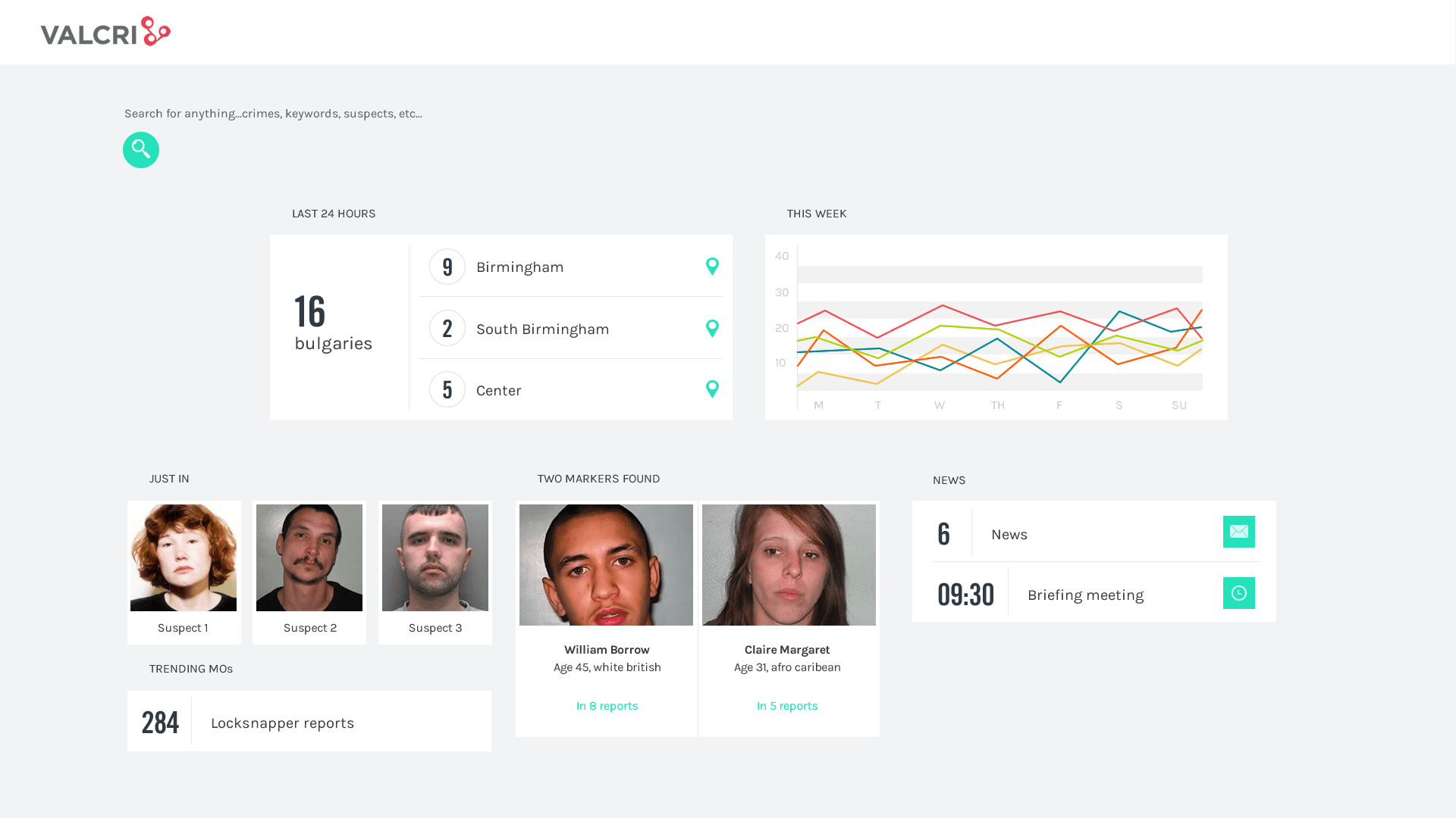
Dashboard Design exploration
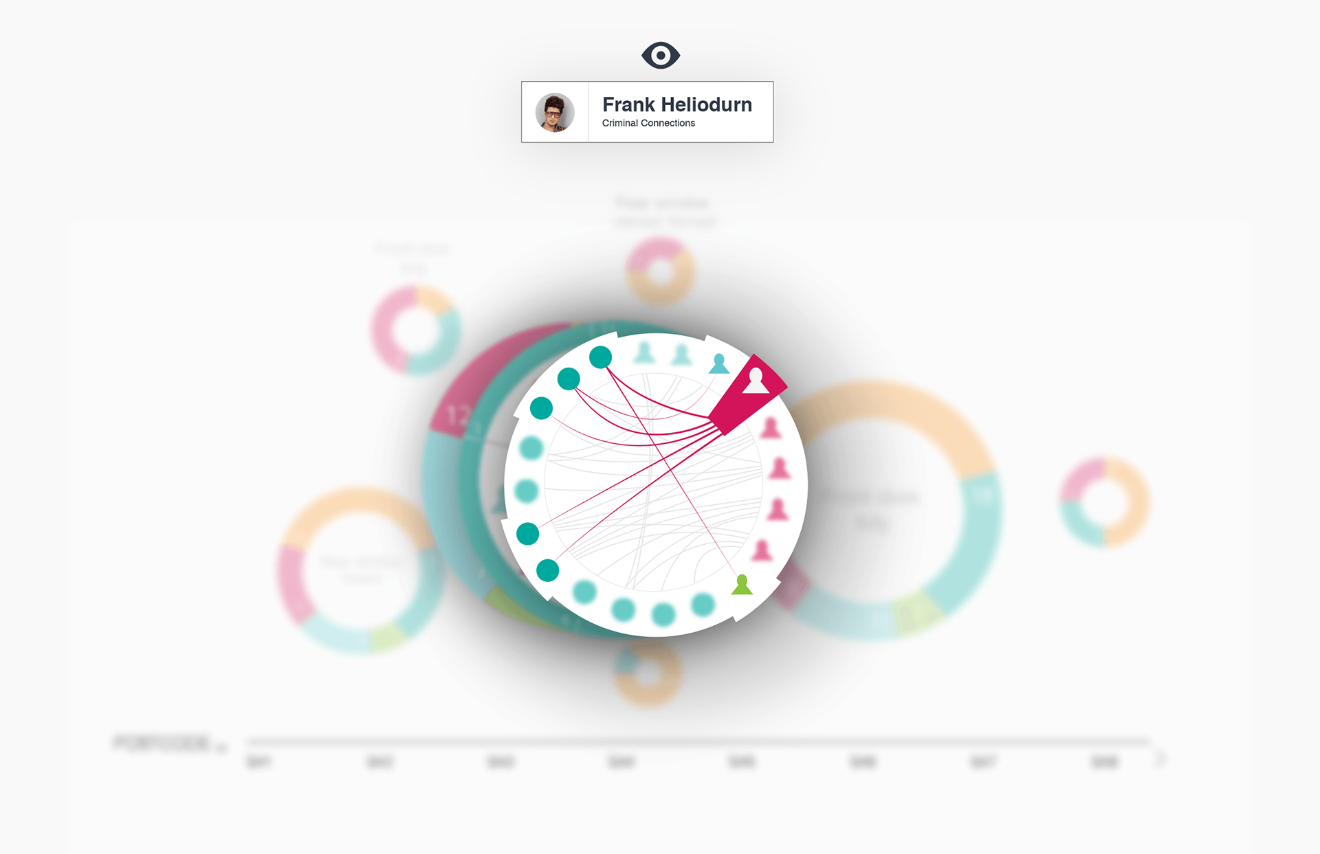
"Associative search" Visual approach
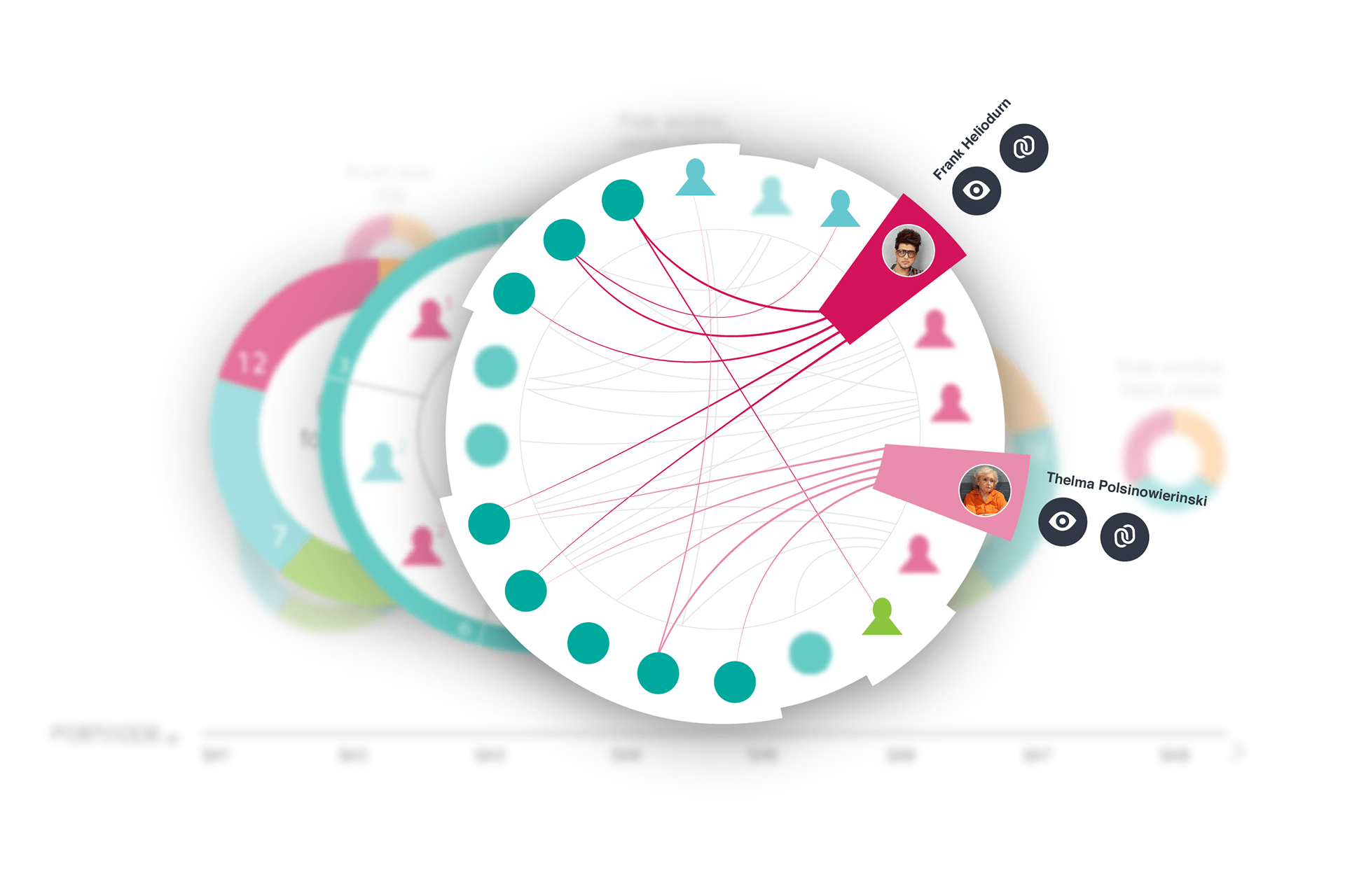
"Associative search" Visual approach
______________________________________
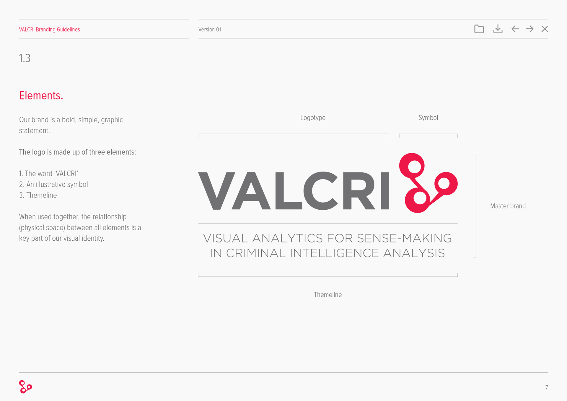
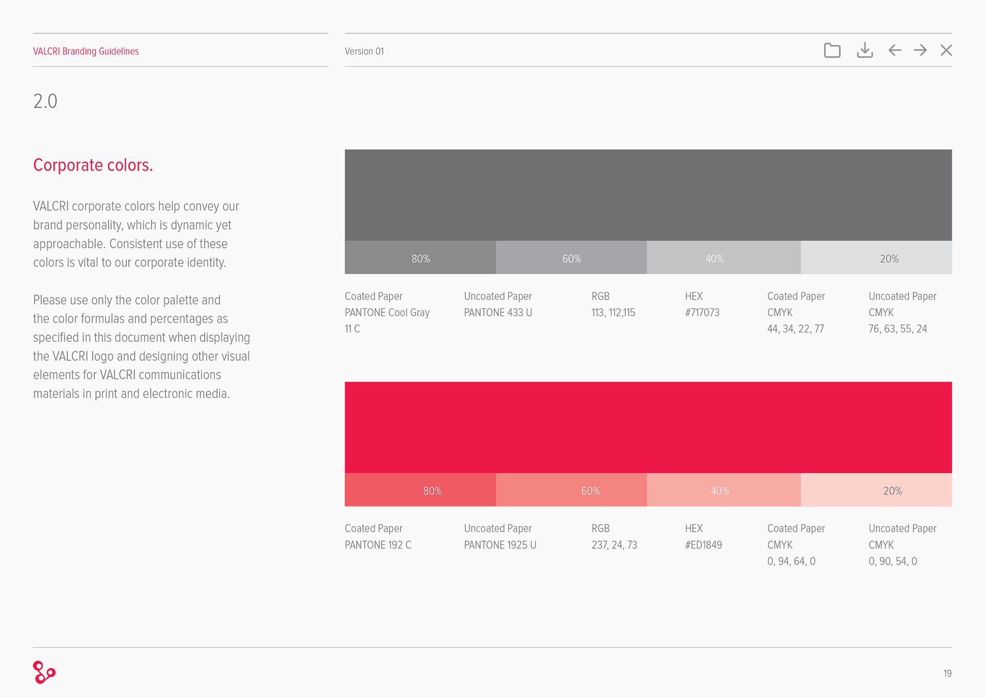
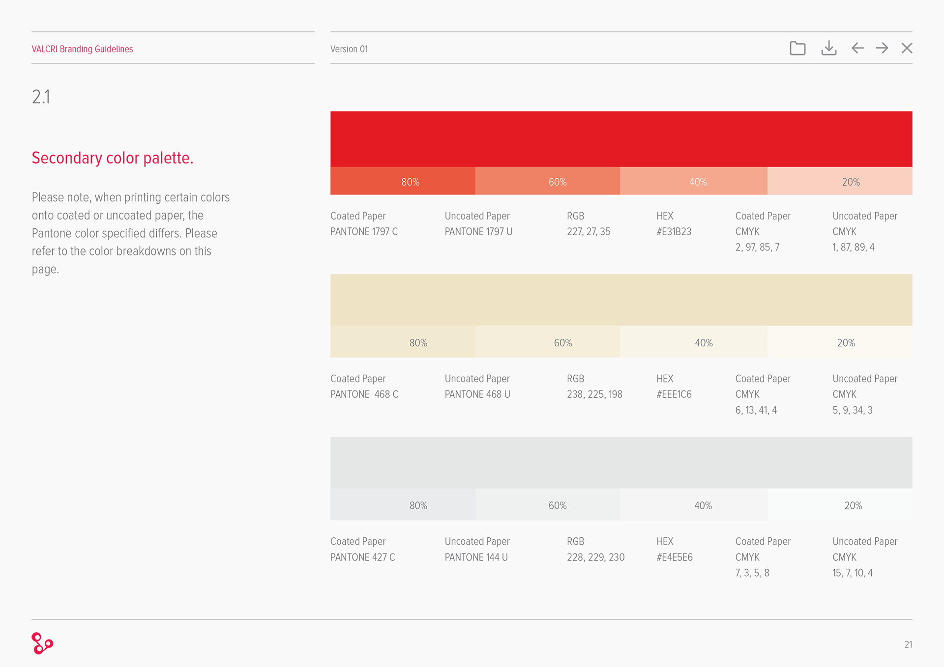
CI and brand Styleguide
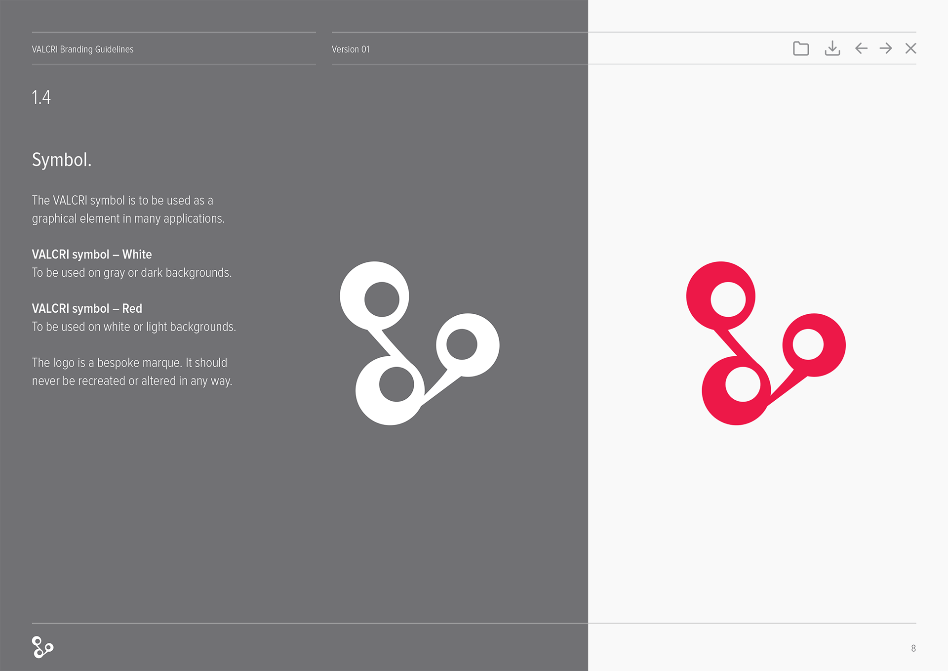
As part of the kickoff activities we created a logo and some brand guidelines: the symbol portrays fluid connections. The 3 circles are an analogy on "how not all thoughts are the same, and not everyone thinks the same way or the same size". A reference to the diverse user group that the system is designed for.
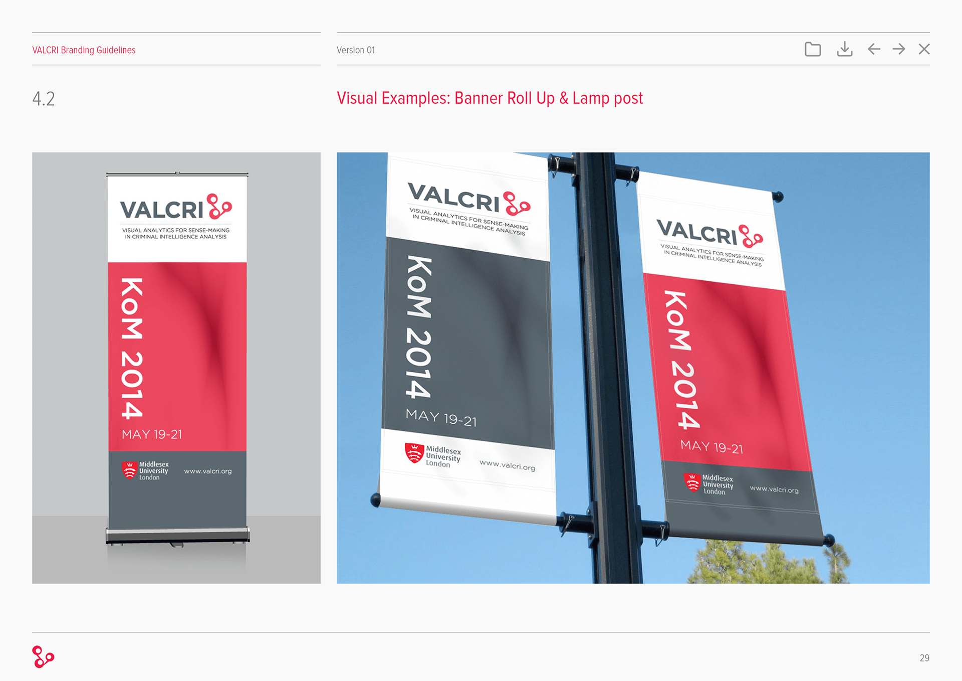
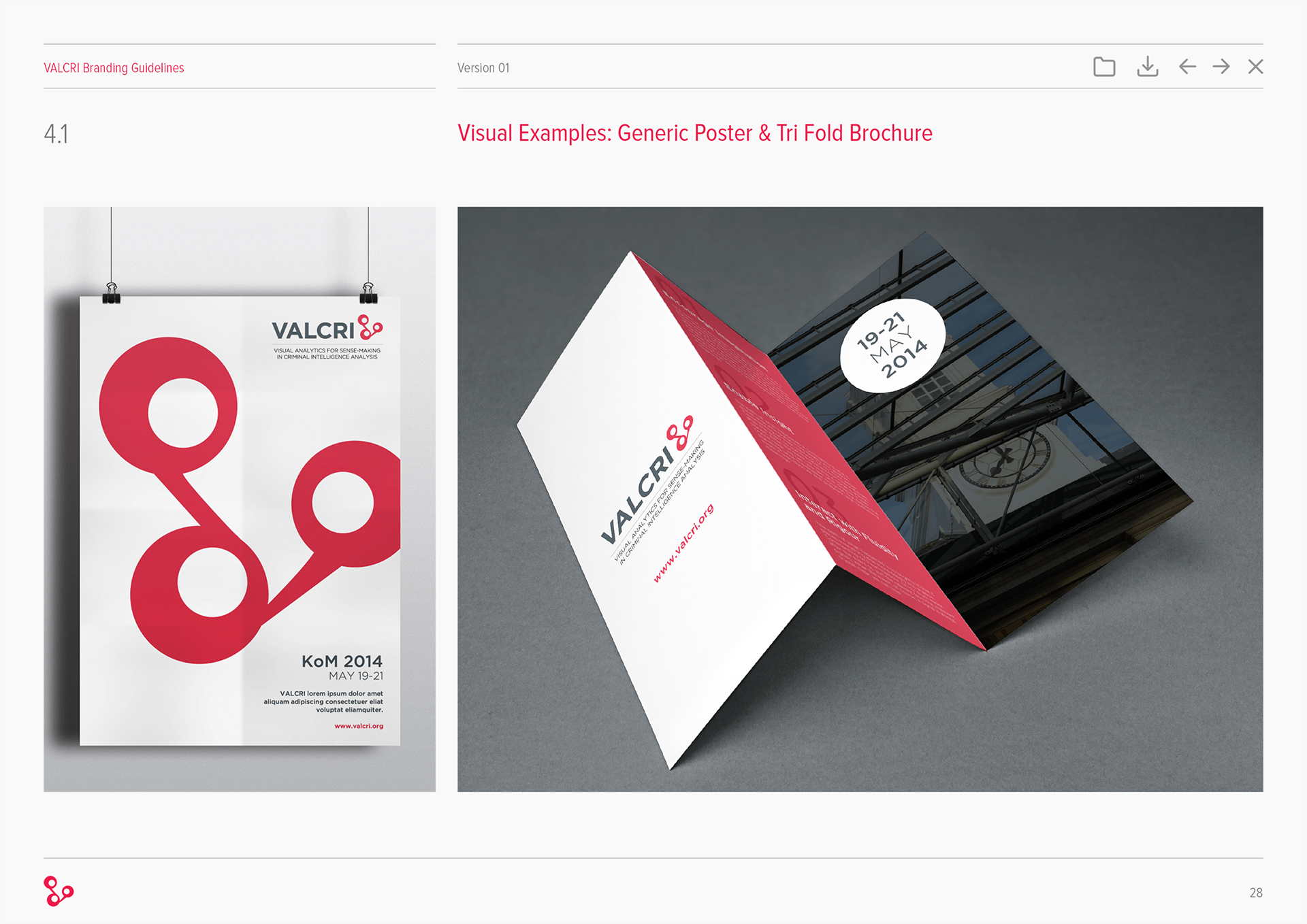
Samples of Style Guide:
______________________________________
Ideation Workshops
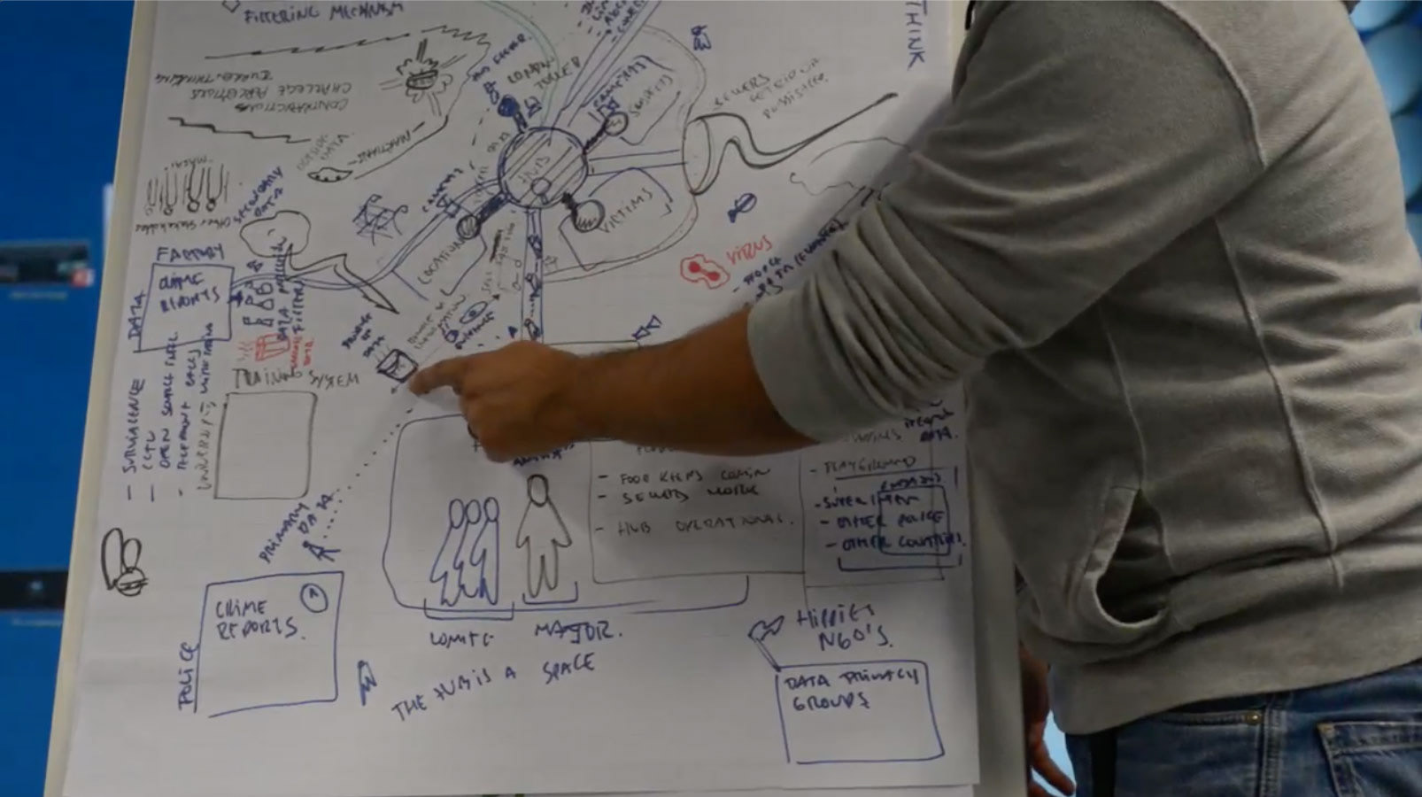
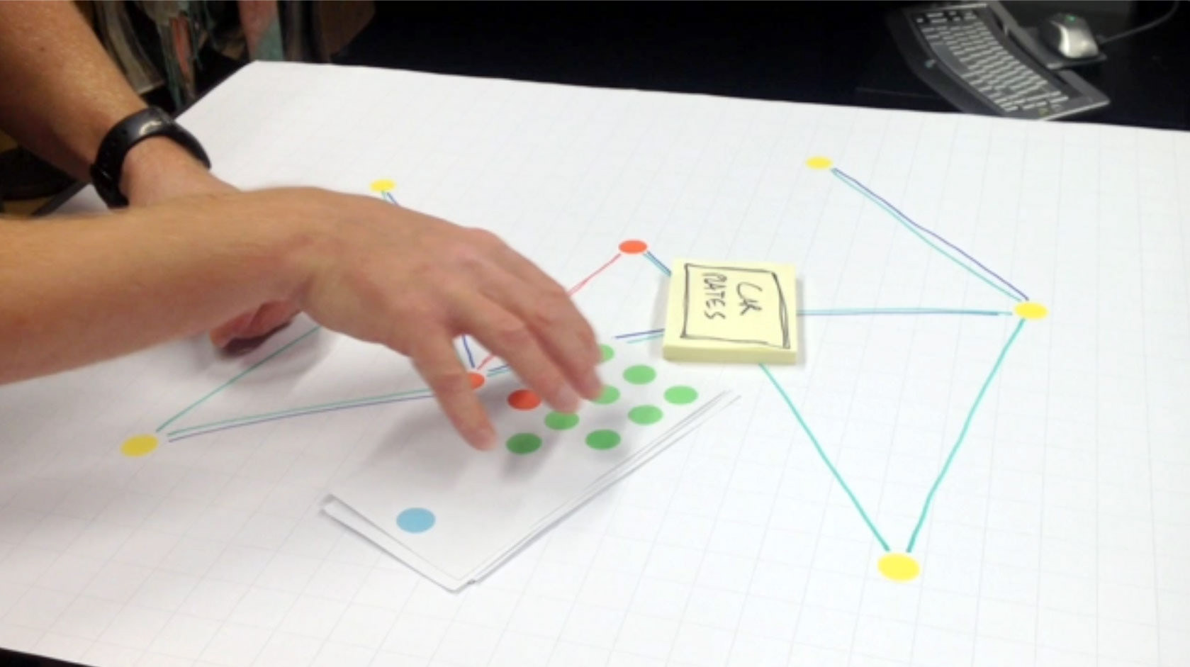
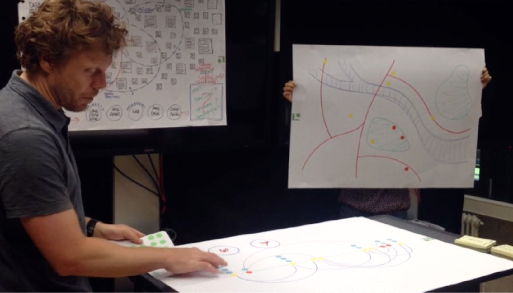
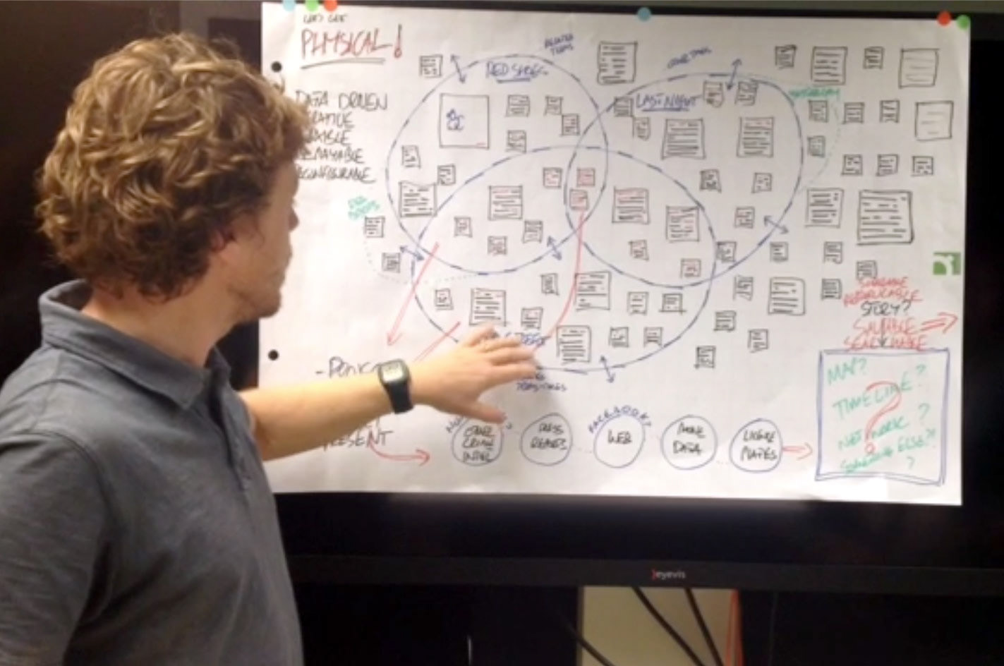
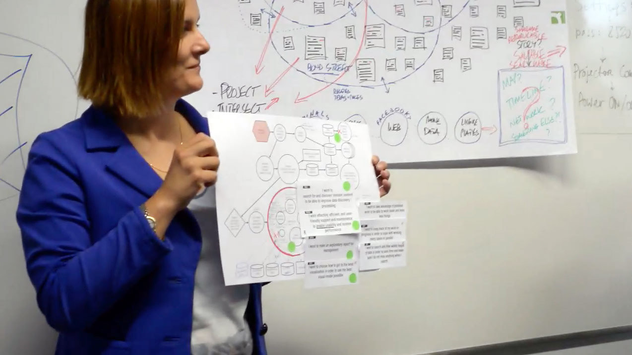
To spark new ideas for potential new UI approaches we facilitated the ideation process by planning and conducting 2 creative workshops.
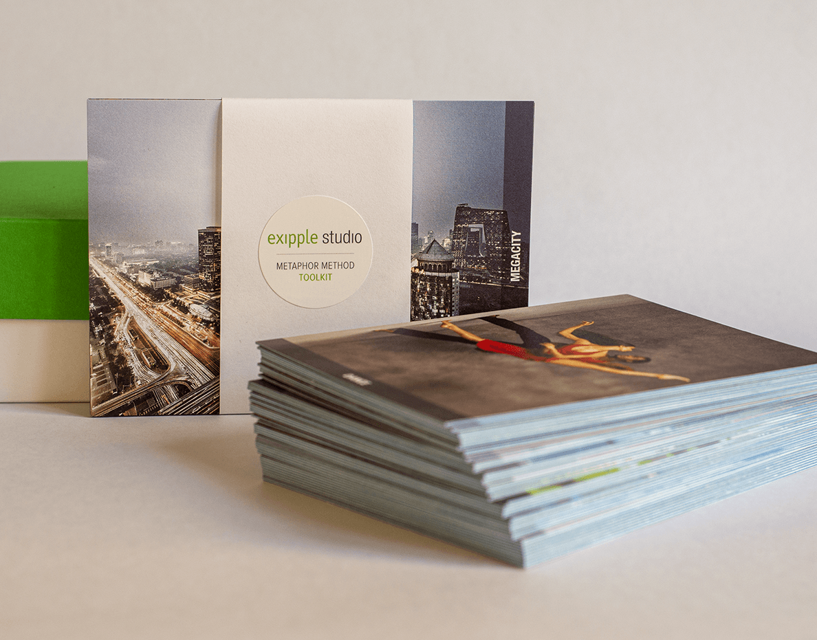
We applied the creative method "metaphor brainstorming", created all prep materials, and guided the discussion on outputs. All ideas were then documented and mapped to existing opportunity areas.
some examples of the presentations of the creative sessions:
